Graphic Design Basics: How to Set Up a File for Print

How do you set a file up for printing? This guide will show all the things you need to look out for!
Creating print-ready files is a crucial skill for graphic designers. Ensuring that your designs translate perfectly from screen to print requires careful attention to several key details.
In this guide, we’ll explore the various things you need to keep in mind when preparing files for print, from resolution and colour space to bleed and file types.
Remember, having a solid understanding of the design basics like this is an essential way of providing value for your clients.
Image Resolution
One of the most important factors in print design is image resolution.
For optimal print quality, all images should be at least 300 dpi (dots per inch). Images with lower resolution can appear blurry or pixelated when printed.
To determine the print size of your image, divide the number of pixels by 300. For example, an image that is 900 pixels wide by 1200 pixels tall will print at 3" x 4".
Alternatively, most tools – like Adobe Illustrator, InDesign, and Photoshop allow you to convert your files into the required size you need, without needing to do the fiddly equations.
Colour Space: CMYK

The number one rule when printing something is that everything you send to the printer should be in the CMYK colour format.
CMYK stands for Cyan, Magenta, Yellow, Key (Black), and it’s the standard for printing. Unlike the RGB (Red, Green, Blue) colour space used for digital screens, CMYK reflects the colour mixing used by printers.
Converting your files to CMYK before sending them ensures the most accurate colour reproduction. Most design software allows you to convert images to CMYK; doing so helps prevent unexpected colour shifts.
On the off chance you don’t have access to professional design software that allows for this, you can use online colour converters like ConvertAColor.
Crop Marks
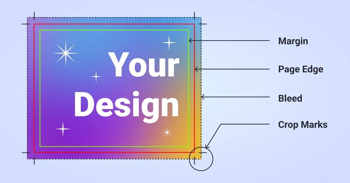
Crop marks are lines printed in the corners of your document to indicate where the paper should be trimmed. These are essential if you are sending your file already imposed.
When using crop marks, ensure they are offset from the finished image by 1/8". This helps the printer know exactly where to cut without affecting the final design.
With this being said, if you’re printing using an external service, it’s best to ask them for their preferred cut lines. 1/8” is usually safe, but depending on what printer/cutting method they’re using, the required cut lines may differ.
Bleed and Safe Zones
When your design extends to the edge of the page, you need to include a bleed. A bleed is an extra 1/8" of image or background colour that extends beyond the cut line. This ensures that there are no white edges when the paper is trimmed.
For example, a business card that is 2" x 3.5" with a full bleed should be set up as 2.25" x 3.75". Additionally, all important elements (such as text or logos) should be placed within the safe zone, at least 1/8" inside the trim line, to avoid being cut off.
Again, depending on the print service you’re using, this may be different. Speak to the printers beforehand to see if they have any templates or specific settings you’re able to use.
As a Note: If you have a good relationship with a printer, and they’re into this idea, printing could be a perfect candidate for a white-label service.
Fonts and Typefaces

To prevent font issues, it's best to outline or flatten fonts in your design software before creating a print-ready file. This ensures that the text appears exactly as intended, regardless of whether the printer has the same fonts installed.
This isn’t a problem if you’re printing something yourself, but will become an issue if you’re sending files to an external printer. If you’ve not flattened the fonts, and the printer doesn’t have the font installed on their end, they’ll be replaced by a default font.
Ideally, you should flatten all your fonts, but if this isn’t an option for you, it’s a good idea to include the necessary font files to avoid any issues with missing or substituted typefaces on behalf of the printer.

File Type
In general, the preferred format for print-ready files is PDF (Portable Document Format). PDFs preserve the layout, fonts, and images of your design, ensuring that it prints exactly as intended.
Most design software allows you to save or export your file as a PDF. Look for options like "Save As" or "Export As" and choose PDF. If, for whatever reason this isn’t available, there are plenty of free PDF conversion tools online, such as the Print Friendly converter.
Keep in mind, however, that online PDF converters may not produce perfect results.
Conclusion
Whilst preparing a file for print involves attention to detail and adherence to specific guidelines, it becomes second nature after you’ve been doing it for a while. You’ll eventually get to the point where you’re naturally building your files with printing in mind.
But for the time being, maintaining a high resolution, using the CMYK colour space, including crop marks and bleeds, outlining fonts, and exporting your work as a PDF, you can ensure that your designs are print-ready and professionally presented for your clients.
And speaking of clients… If you’re new to graphic design and are finding it hard to get new clients, this guide will show you helpful strategies!


![25 Key Skills to Master as a Graphic Designer [INFOGRAPHIC]](https://images.squarespace-cdn.com/content/v1/5cfebab7bfcecb000194cc60/1717168784049-14QQO0CS8T6EO3X916KM/02+-+Cover+-+25+Key+Skills+to+Master+as+a+Graphic+Designer.png)


![Affirmations for Graphic Designers to Help You Keep Going [INFOGRAPHIC]](https://images.squarespace-cdn.com/content/v1/5cfebab7bfcecb000194cc60/1711646088600-495MRCVU0Y8Y9GS07B7A/05+-+Cover+-+Affirmations+for+Graphic+Designers+to+Help+You+Keep+Going.png)
![Colour Psychology: What Colours Mean Around the World [INFOGRAPHIC]](https://images.squarespace-cdn.com/content/v1/5cfebab7bfcecb000194cc60/1711645558379-2W1EOZ0VHHFYZOL9OIV9/04+-+Cover+-+Colour+Psychology+-+What+Colours+Mean+Around+the+World+%5BINFOGRAPHIC%5D+.png)
